Optimising is the engineer’s purest reflex: run the options, take the top. But the maximum of a set of noisy measurements is biased upward — you selected partly for quality and partly for luck — so the winner regresses and your best result disappoints, not by accident but on schedule. The cure isn’t more precision; it’s shrinking the number back towards what you expected before you looked.
Author
Matthew Gibbons
Published
3 July 2026
I ran a sweep last month — a couple of dozen variants of the same model, each scored on the same held-out set — and one of them finished a clear head above the rest. So I did the obvious thing. I took the winner, wrote it up, and shipped it. In production it was fine. Good, even. Just not as good as the number that had won it the sweep: a point and a half of the margin had quietly evaporated somewhere between the validation table and the live traffic, and I spent the better part of an afternoon hunting for the bug that had eaten it.
There was no bug. What I had run into is so reliable that it has a name, and this week I watched Andrew Gelman dust it off on his blog — the optimiser’s curse. Once I’d seen it I couldn’t unsee it — not an occasional hazard of optimising so much as a property of the thing itself.
The maximum is a biased estimator
Start with the thing every engineer already believes, because it’s true: one measurement wobbles. A benchmark score, an A/B lift, a validation metric — each is the real quantity plus a bit of noise, and nobody sane ships off a single sample. Fine. Now do the thing engineers are trained to do with a column of numbers: take the best one.
That single, innocent act — max, argmax, sort-descending-and-read-off-the-top — is where the trouble comes in. When you pick the highest score out of many, you are not picking the option with the highest true quality. You are picking the option with the highest true quality plus noise, and those are not the same selection. A merely-good option that caught a lucky draw will out-score a genuinely-better option that caught an unlucky one. So the winner is, disproportionately, whoever the noise smiled on — and its measured score is inflated by exactly the luck that put it on top.
The uncomfortable part is the direction. This isn’t the familiar “measurements jitter both ways, so it comes out in the wash”. Selection only ever reaches upward. The act of choosing the best filters for favourable noise, every time, so the winning number is biased high as a matter of arithmetic, not misfortune. Your best result is the one most contaminated by luck, precisely because being lucky is part of how it got to be your best result.
Show the code behind this figure
import numpy as npimport matplotlib.pyplot as pltrng = np.random.default_rng(0)tau, sigma =1.0, 1.0# spread of true quality; measurement noiseshrink = tau**2/ (tau**2+ sigma**2) # how far to pull each score backtrials =20000ns = [2, 3, 5, 10, 20, 50, 100]raw, shrunk = [], []for n in ns: theta = rng.normal(0, tau, size=(trials, n)) # true quality of each option y = theta + rng.normal(0, sigma, size=(trials, n)) # what we actually measure win = y.argmax(axis=1) # the optimiser takes the top score idx = (np.arange(trials), win) raw.append((y[idx] - theta[idx]).mean()) # raw score minus true value shrunk.append((shrink * y[idx] - theta[idx]).mean()) # shrunk score minus true valuefig, ax = plt.subplots(figsize=(10, 4.2))fig.patch.set_alpha(0)ax.patch.set_alpha(0)ax.plot(ns, raw, '-o', color='#D55E00', linewidth=2.5, label='Report the raw winning score')ax.plot(ns, shrunk, '-o', color='#0072B2', linewidth=2.5, label='Report the shrunk estimate')ax.axhline(0, color='grey', linewidth=1, linestyle=':')ax.set_xscale('log')ax.set_xticks(ns)ax.set_xticklabels(ns)ax.set_xlabel('Number of options you optimised over')ax.set_ylabel('Average overstatement of the winner\n(reported − true)')ax.set_title('The harder you optimise, the more the winner overstates itself')ax.legend(frameon=False, loc='upper left')ax.spines['top'].set_visible(False)ax.spines['right'].set_visible(False)ax.yaxis.grid(True, linestyle=':', alpha=0.4, color='grey')ax.set_axisbelow(True)plt.tight_layout()plt.show()
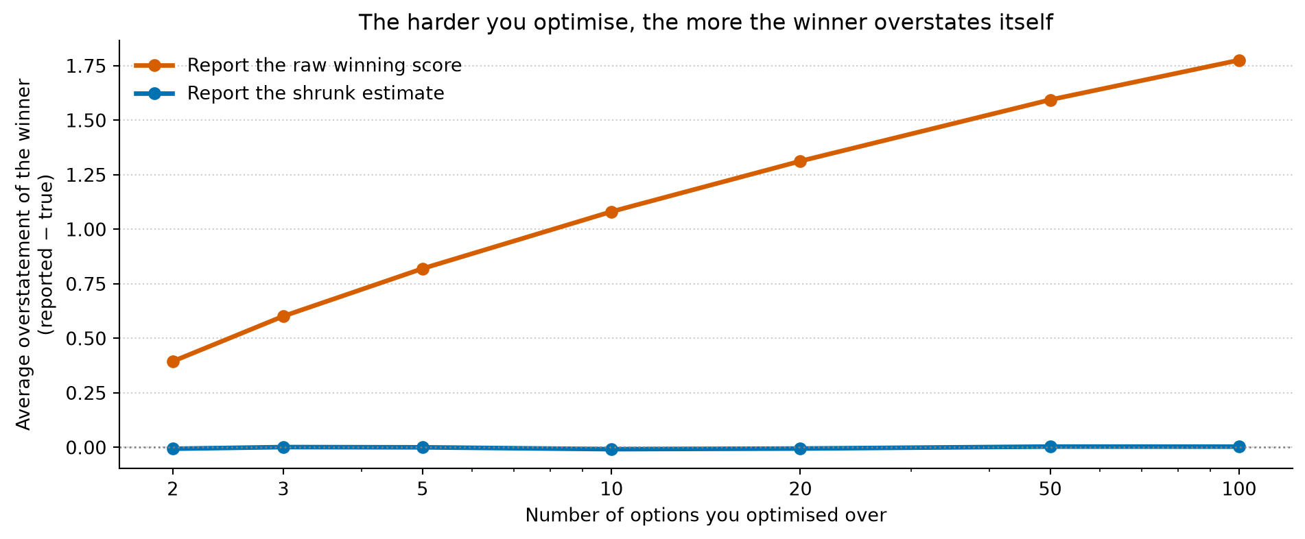
Figure 1: Twenty thousand simulated sweeps at each width. Every option has a true quality plus measurement noise of the same size, and the optimiser picks whichever option has the highest measured score. Reporting that raw score (orange) overstates the winner’s true value by an amount that grows with the number of options searched — from about 0.4 at two options to nearly 1.8 at a hundred. Shrinking every score back towards the prior before reporting (blue) leaves the choice of winner almost unchanged, but removes the overstatement: the honest number sits flat on zero however hard you searched.
It gets worse the harder you look
Here is the genuinely vicious bit, the part that turns a curiosity into something worth changing your habits over: the bias grows with how hard you searched.
Think about why. Each extra candidate you throw into the sweep is another roll of the dice — another chance for something mediocre to draw a generous measurement and leap to the front. Two options, and luck barely moves the winner. A hundred options, and you have given noise a hundred tries to manufacture a champion. The figure is the whole story: with two candidates the winner overstates itself by about four-tenths of a standard error; by a hundred candidates it is overstating itself by nearly two. The line goes up, and it does not come back down.
Which means the engineering virtue is the problem. Exhaustive search — try every learning rate, sweep the grid, run all twelve variants of the button, benchmark the entire model zoo — is exactly the behaviour that sharpens the curse. The more diligently you optimise, the more of your winner’s margin is air. “We tested more configurations than anyone” is not the reassurance it sounds like; it is a quiet confession that your reported best is more inflated than a lazier team’s would have been.
This is not the leaderboard problem again
It’s a cousin of something I’ve written about before — that a leaderboard prints no error bars, and the gap between first and second is usually well inside the noise. But it’s a distinct failure, and worth keeping separate. There, the trouble was that “won” meant nothing: the race was too close to call. Here, the race can be a rout — the winner genuinely is the best of the batch — and its number is still wrong. Even when you have picked the right thing, you have mis-measured how good it is, and you have mis-measured it in a predictable direction. One problem is about the ranking; this one is about the price tag.
Shrinkage, not precision
The instinct, having found a directional error, is to attack it with precision: run the eval on more tasks, collect more traffic, grind the noise down until the winner’s score is trustworthy. It helps at the margins, but it does not cure the disease, because the bias lives in the selection, not in the sample size. As long as any noise remains — and it always does — optimising hard enough over enough candidates will find it and stand on it.
The fix I eventually landed on is the one I’d have called heretical a few years ago: don’t believe the number. Pull it back towards what you expected before you looked. Every measured score is evidence, but it’s evidence to be combined with a prior, not taken at face value, and the combination — the shrunk estimate, the regularised estimate, the posterior mean, pick your vocabulary — sits sensibly between the raw measurement and your prior expectation. Shrink every candidate’s score towards the middle before you crown a winner and two things happen. You usually still pick the same option, because shrinkage preserves the order. But the number you report for it is honest: in the figure, the shrunk line lies flat on zero no matter how hard you searched. The disappointment doesn’t arrive, because the surprise was priced in.
In practice this is less exotic than it sounds. It’s why a seasoned experimenter discounts the winning arm of an A/B test rather than quoting its raw lift, and holds out a fresh sample to see how much of the effect survives contact with reality. It’s why the honest forecast for my shipped model was always going to sit below the score that won it the sweep — and the useful version of that afternoon wasn’t hunting for a bug, it was being able to say, in advance, roughly how much of the margin I should expect to keep.
So: plan to be disappointed by your best result. Not as pessimism — as calibration. The gap between the score that won and the value you realise isn’t a sign that something went wrong; it’s the tax the maximum charges for being chosen out of many, and you can estimate the bill before it arrives.
Whether I manage it every time is another matter. Shrinking a number you’re pleased with, in public, before anyone has asked you to, takes a composure I have on some days and not others. The sweeps where I’ve quietly skipped the step are, predictably, the ones where the margin looked too good to spoil. Take the winner, by all means. Just try not to pay full price for its number.
Part of an occasional series reframing everyday engineering through a data scientist’s eyes. The ideas here are developed properly in Thinking in Uncertainty and Building with Certainty.