Behind every dataset is a process that generated it. You never see that process directly. You reverse-engineer it from observation, and it doesn’t come with documentation.
Author
Matthew Gibbons
Published
17 January 2026
You’ve integrated with a third-party API that ships without documentation. You know the drill: call the endpoint, study the responses, and build a mental model of the internal logic. You never get to read the source code. You infer behaviour from output.
Statistical modelling works the same way, just aimed at natural processes rather than services. Behind every dataset sits a data-generating process (DGP): the real-world mechanism that produced the observations. We never see it directly. We only see its output and reason backwards.
The analogy captures the right activity (reverse-engineering behaviour from observations) but the thing you’re reverse-engineering is different in kind.
No versioning, no changelog
A well-maintained API has a version number, release notes, and deprecation warnings. When behaviour changes, someone tells you. A data-generating process has none of this. Customer behaviour shifts, markets move, seasons turn, and there’s no status page to tell you when it happens.
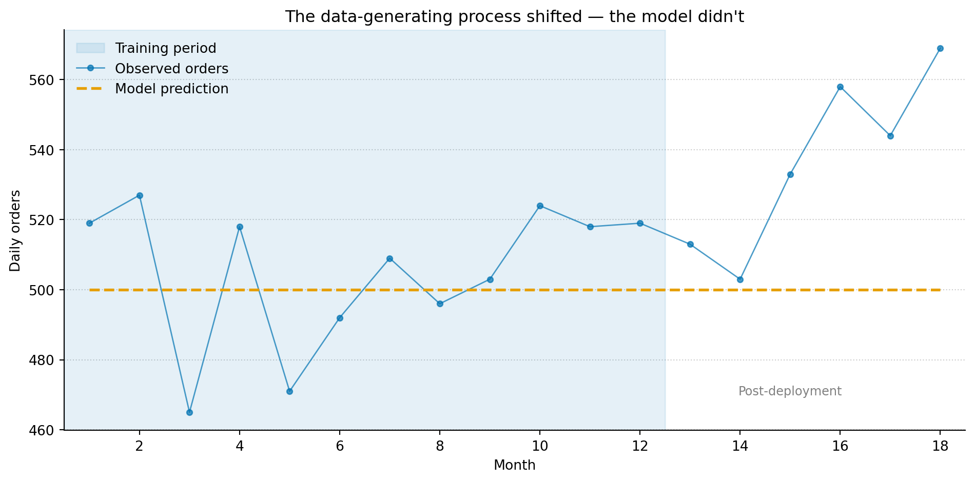
Consider a model that predicts daily order volume for an e-commerce platform. You train it on twelve months of data, it performs well, and you deploy it. Three months later, the predictions start drifting. Not catastrophically, just a slow, consistent undershoot. What happened?
Maybe a competitor launched. Maybe a marketing campaign shifted the customer mix. Maybe a supply chain disruption changed purchasing patterns. The DGP changed, and it didn’t file a ticket.
import numpy as npimport matplotlib.pyplot as pltrng = np.random.default_rng(42)months = np.arange(1, 19)# True process: stable for 12 months, then gradual upward shiftbaseline =500true_rate = np.where(months <=12, baseline, baseline +15* (months -12))observed = rng.poisson(lam=true_rate)# Model trained on months 1-12: predicts baseline rate forevermodel_pred = np.full_like(months, baseline, dtype=float)fig, ax = plt.subplots(figsize=(10, 5))fig.patch.set_alpha(0)ax.patch.set_alpha(0)ax.axvspan(0.5, 12.5, alpha=0.10, color='#0072B2', label='Training period')ax.plot(months, observed, color='#0072B2', marker='o', markersize=4, linewidth=1, alpha=0.7, label='Observed orders')ax.plot(months, model_pred, color='#E69F00', linewidth=2, linestyle='--', label='Model prediction')ax.annotate('Post-deployment', xy=(15, baseline -30), fontsize=9, color='grey', ha='center')ax.set_xlabel('Month')ax.set_ylabel('Daily orders')ax.set_title('The data-generating process shifted — the model didn\'t')ax.set_xlim(0.5, 18.5)ax.spines['top'].set_visible(False)ax.spines['right'].set_visible(False)ax.yaxis.grid(True, linestyle=':', alpha=0.4, color='grey')ax.set_axisbelow(True)ax.legend(loc='upper left', framealpha=0.0)plt.tight_layout()plt.show()
Figure 1: A model trained on 12 months of data (blue region) performs well during that period. After deployment, the data-generating process shifts — predictions (amber dashed line) begin to undershoot observations (blue points) as the gap between the model’s assumptions and reality grows.
In software terms, this is the equivalent of a dependency silently changing its behaviour between versions. Except there are no versions. You detect the drift from the data itself, by monitoring the gap between what the model expects and what actually arrives.
It returns a distribution, not a response
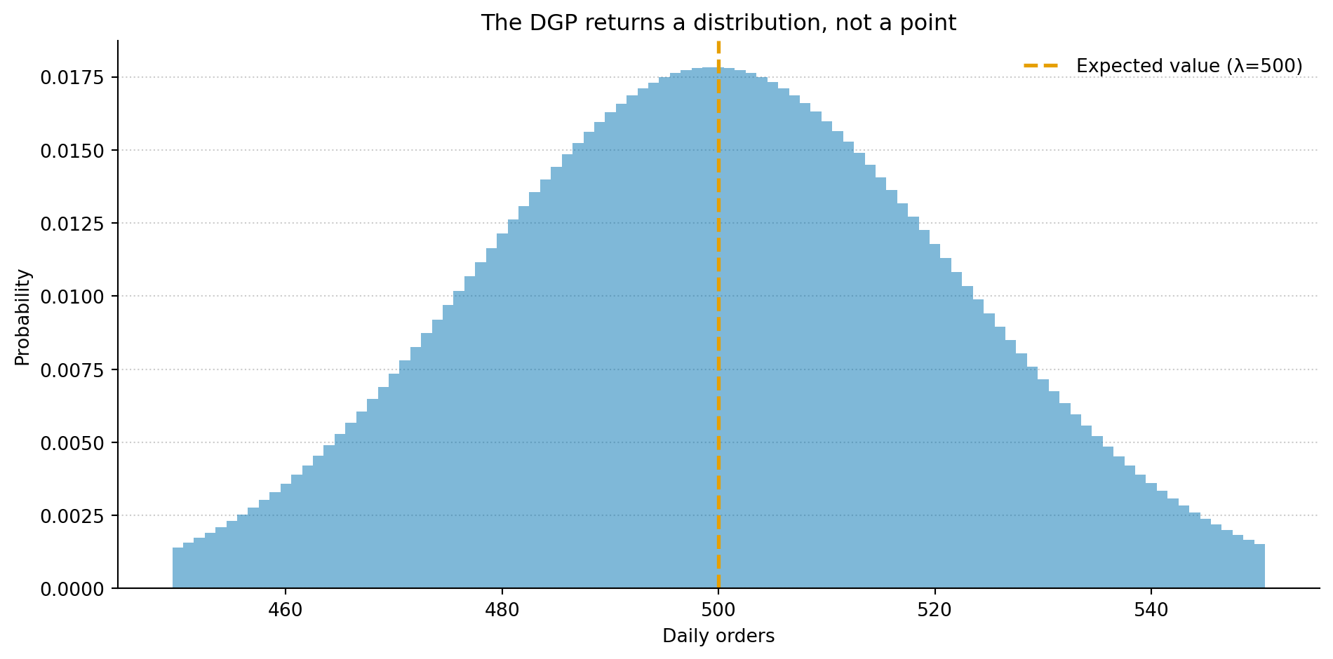
But the difference runs deeper. In theory, a well-behaved API returns the same response for the same request. In practice, hidden state (caches, rate limits, server-side A/B tests, etc.) can make even a deterministic service look unpredictable from the caller’s side. A data-generating process takes that further: it returns a distribution of responses. A spread of plausible outcomes, each with an associated probability.
When you ask “how many orders will we get tomorrow?”, the DGP doesn’t have a single answer. It has a range of answers, some more likely than others. The model’s job isn’t to nail the single right number. It’s to describe that range: its centre, its spread, its shape.
from scipy import statsfig, ax = plt.subplots(figsize=(10, 5))fig.patch.set_alpha(0)ax.patch.set_alpha(0)lam =500x = np.arange(450, 551)pmf = stats.poisson.pmf(x, lam)ax.bar(x, pmf, color='#0072B2', alpha=0.5, width=1.0, edgecolor='none')ax.axvline(lam, color='#E69F00', linewidth=2, linestyle='--', label=f'Expected value (λ={lam})')ax.set_xlabel('Daily orders')ax.set_ylabel('Probability')ax.set_title('The DGP returns a distribution, not a point')ax.spines['top'].set_visible(False)ax.spines['right'].set_visible(False)ax.yaxis.grid(True, linestyle=':', alpha=0.4, color='grey')ax.set_axisbelow(True)ax.legend(loc='upper right', framealpha=0.0)plt.tight_layout()plt.show()
Figure 2: The data-generating process doesn’t return a single value. It returns a distribution of plausible outcomes. The model’s job is to describe that distribution — its centre, spread, and shape — not to predict a single number.
This is what makes data science different from integrating with a deterministic service. You’re not trying to figure out what the API does. You’re trying to figure out what it might do, and with what probability.
Detecting change
If the DGP doesn’t announce when it changes, how do you know? The same way you’d detect a degraded dependency: monitoring.
In production systems, you watch latency percentiles, error rates, and throughput. When they drift outside expected bounds, something has changed. In data science, you do the same thing with your model’s predictions. You compare what the model expects to what actually arrives, and you watch for systematic discrepancies.
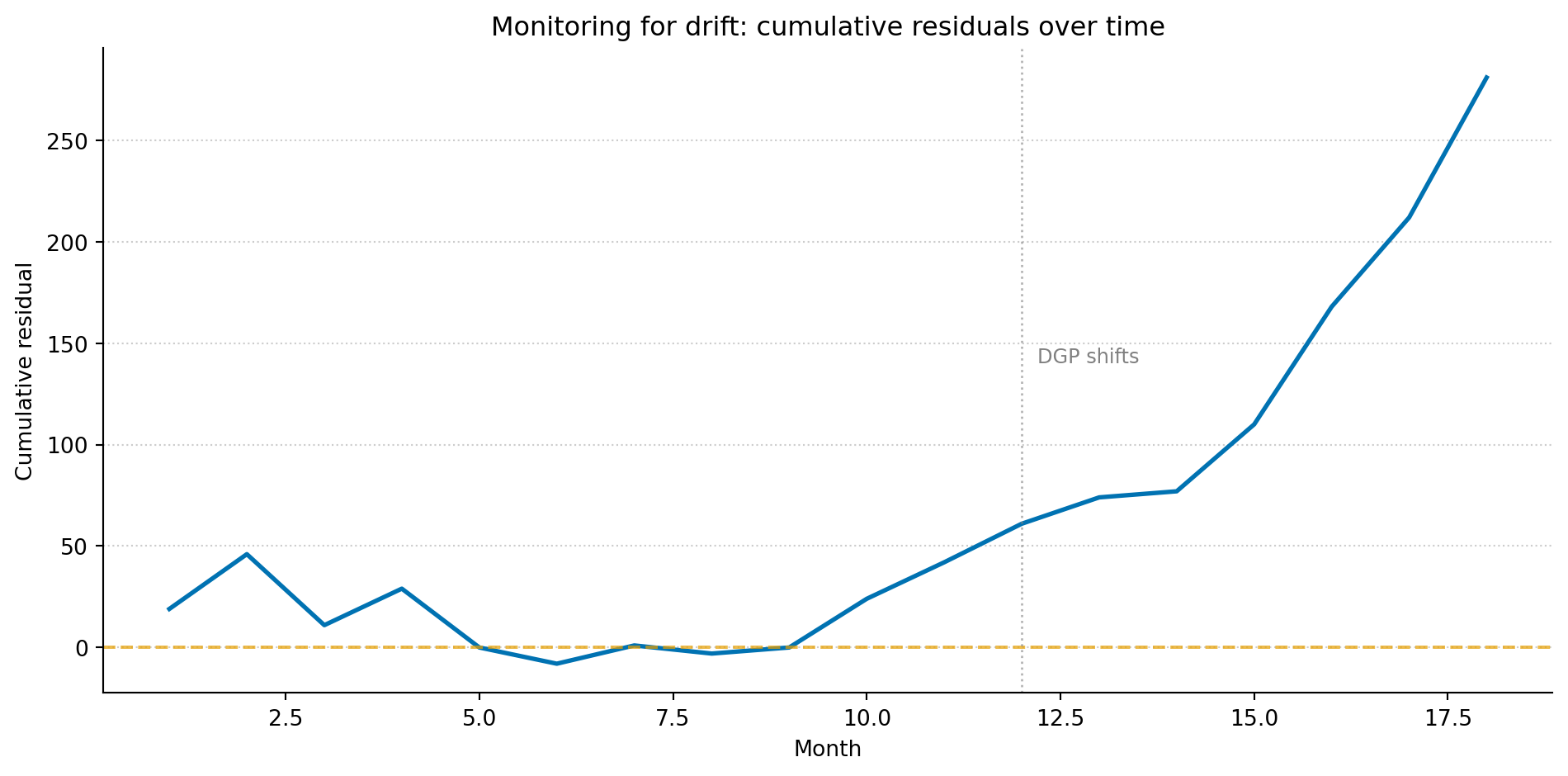
The simplest version of this is tracking the residuals (the gaps between predictions and observations) over time. If the residuals are centred around zero and show no trend, the model’s assumptions still hold. If they start drifting in one direction, the DGP has moved and the model hasn’t kept up.
Figure 3: Cumulative residuals over time. During the training period, they fluctuate around zero — the model’s predictions are unbiased. After the DGP shifts at month 12, the cumulative residuals begin climbing steadily, signalling that the model is systematically underpredicting.
More sophisticated approaches exist (statistical tests for distributional drift, sliding-window comparisons, Bayesian change-point detection) but the principle is the same one you already apply to production monitoring. Watch the right signals, set thresholds, and respond when something moves.
Models are hypotheses about the process
This framing changes what a model is. It’s not a function that maps inputs to outputs. It’s a hypothesis about the data-generating process — a claim about what mechanism produced the data you observed. When you fit a linear regression, you’re claiming that the relationship between your variables is approximately linear and that the noise is roughly constant. When you fit a Poisson model, you’re claiming that events occur independently at a roughly constant rate.
These claims might be wrong. The relationship might be nonlinear. The rate might vary. The events might not be independent. That’s fine because all models are simplifications. The question isn’t whether the model is perfectly right. It’s whether the simplification is useful: does it capture enough of the structure to answer the questions you care about, and do the residuals tell you where it falls short?
This is reverse-engineering without the luxury of documentation. You propose a mechanism, check it against the data, and revise. The DGP never confirms you’ve got it right. You just accumulate evidence that your model is a reasonable approximation, until the process changes and you start again.
This article is part of a series drawn from Thinking in Uncertainty, a book that teaches data science to experienced software engineers.