Engineers see regression as drawing a line through points. Statisticians see it as separating signal from noise — and that framing changes what you can learn from a model.
Author
Matthew Gibbons
Published
10 January 2026
If you’ve ever used a least-squares fit to draw a trend line through data, you already know the mechanics of regression. numpy.polyfit, a scatter plot, a line that minimises the distance to the points. Most engineers can set this up in a few minutes. The mechanics are correct. The mental model that comes with them usually isn’t.
The curve-fitting instinct says: find the function that best matches the data. Regression asks a different question: what systematic relationship exists between these variables, and how much variation is left unexplained? The first framing cares about the line. The second cares just as much about the gaps between the line and the data. That shift in attention — from the fit to the residuals — is where regression becomes a tool for understanding, not just prediction.
The decomposition you didn’t notice
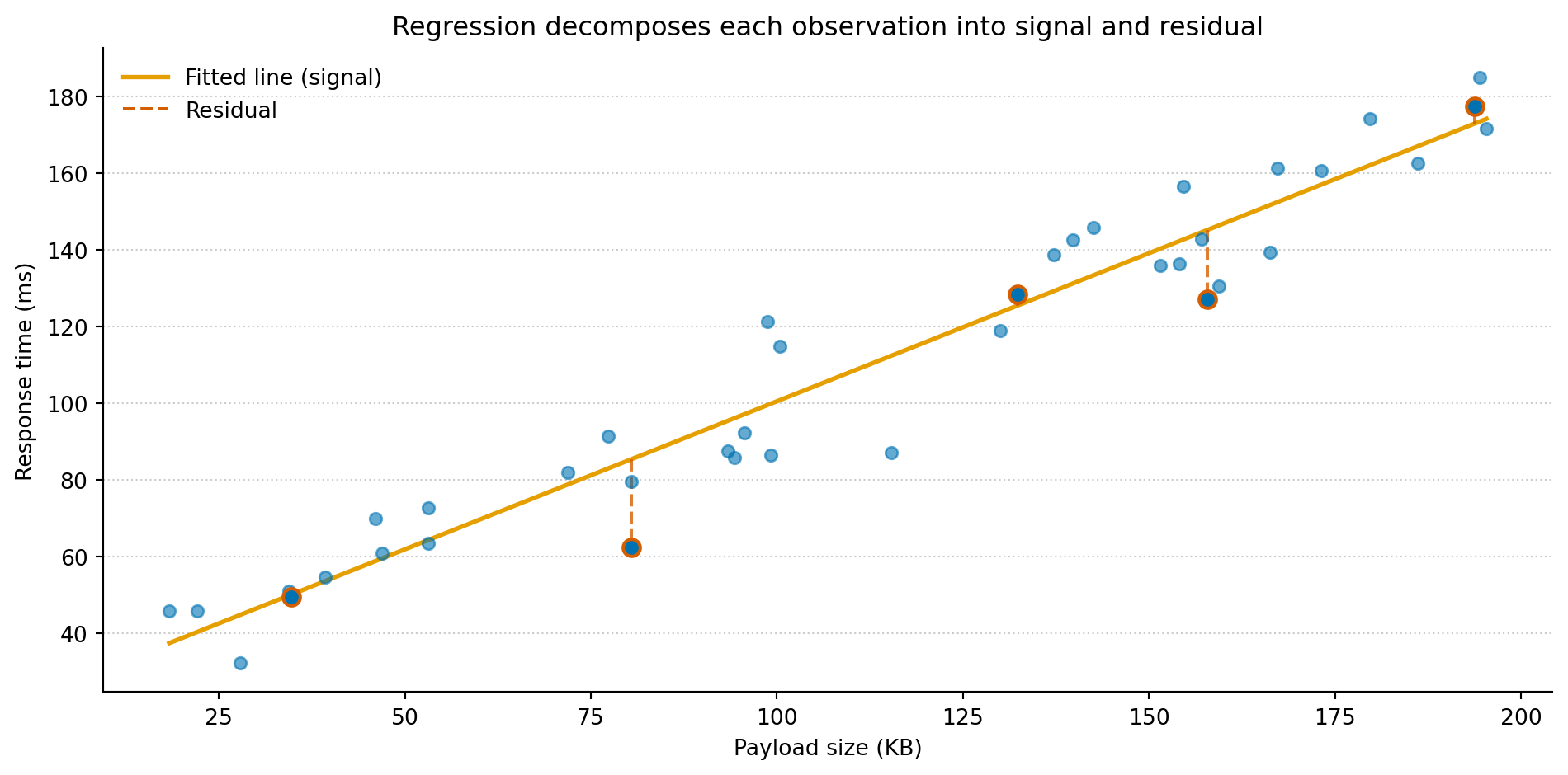
Imagine you’re investigating API performance. You suspect that response time increases with payload size, and you have a few weeks of production logs to work with. The engineering instinct is to plot the data, fit a line, sanity-check it, and move on. That instinct is sound. But watch what the fit actually computes:
import numpy as npimport matplotlib.pyplot as pltrng = np.random.default_rng(42)# Simulated production logs: payload size vs response timen =40payload_kb = np.sort(rng.uniform(10, 200, size=n))true_intercept =20# base latency, mstrue_slope =0.8# ms per KBnoise = rng.normal(0, 15, size=n)response_ms = true_intercept + true_slope * payload_kb + noise# Fit a linear modelcoeffs = np.polyfit(payload_kb, response_ms, 1)fitted = np.poly1d(coeffs)# Pick five points to annotatehighlight = [4, 12, 22, 30, 37]fig, ax = plt.subplots(figsize=(10, 5))fig.patch.set_alpha(0)ax.patch.set_alpha(0)ax.scatter(payload_kb, response_ms, color='#0072B2', alpha=0.6, s=30, zorder=3)x_line = np.linspace(payload_kb.min(), payload_kb.max(), 200)ax.plot(x_line, fitted(x_line), color='#E69F00', linewidth=2, label='Fitted line (signal)')for i in highlight: y_hat = fitted(payload_kb[i]) ax.plot([payload_kb[i], payload_kb[i]], [y_hat, response_ms[i]], color='#D55E00', linewidth=1.5, linestyle='--', alpha=0.8) ax.scatter(payload_kb[i], response_ms[i], color='#0072B2', s=60, zorder=4, edgecolors='#D55E00', linewidth=1.5)ax.plot([], [], color='#D55E00', linewidth=1.5, linestyle='--', label='Residual')ax.set_xlabel('Payload size (KB)')ax.set_ylabel('Response time (ms)')ax.set_title('Regression decomposes each observation into signal and residual')ax.spines['top'].set_visible(False)ax.spines['right'].set_visible(False)ax.yaxis.grid(True, linestyle=':', alpha=0.4, color='grey')ax.set_axisbelow(True)ax.legend(loc='upper left', framealpha=0.0)plt.tight_layout()plt.show()
Figure 1: Every observation decomposes into a fitted value (on the amber line) and a residual (the dashed red segment). The line is the model’s claim about the systematic relationship. The residuals are everything it can’t explain.
Each dashed red segment is a residual: the difference between what the model predicts and what actually happened. The amber line represents the model’s claim about the systematic part of the relationship — payload size explains this much of the variation in response time. Everything the line can’t account for lands in the residuals. Curve fitting stops at the line. Regression asks you to look at both.
Coefficients are claims, not parameters
polyfit gives you two numbers: a slope and an intercept. The curve-fitting reading stops there — useful for drawing a line, but that’s about it.
The regression reading is different. The slope is a claim: for every additional kilobyte of payload, response time increases by about 0.8 milliseconds. The intercept is another claim: a near-empty request takes roughly 20 milliseconds of base latency. These aren’t just parameters that minimise squared error. They’re statements about the world that you can interrogate.
Is the slope meaningfully different from zero, or could the apparent relationship be noise? How precise is the estimate? Would a different sample of production logs give you 0.5 or 1.1? If you add a second variable, say time of day, does the payload effect hold up or shrink? These are the questions regression was built to answer. Curve fitting doesn’t even know to ask them.
This is the biggest practical difference between the two framings. A curve fitter hands you a function and moves on. Regression hands you a set of testable claims, each with a measure of uncertainty, and invites you to be sceptical about every one of them.
Residuals talk back
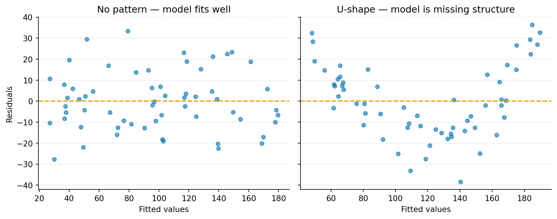
If the coefficients are your model’s claims about the signal, the residuals are everything it left unexplained. Most engineers glance at the fitted line and move on. Statisticians look at the residuals first.
The logic is the same as reading application logs. If your service is healthy, the logs are boring: routine requests, no patterns, nothing to act on. If something is wrong, structure appears: repeated errors, correlated timeouts, a pattern that shouldn’t be there. Residuals work the same way. If the model has captured the systematic relationship, the leftovers should look like random noise: no trends, no curves, no fanning out. If they don’t, the model is missing something.
Figure 2: No pattern (left): residuals from a well-specified linear model scatter randomly around zero — healthy noise with no structure. U-shape (right): residuals from a linear model fit to data with a curved relationship show a structured pattern — the model is missing something systematic.
In the ‘No pattern’ panel (left), the residuals scatter randomly around zero. This is what healthy residuals look like — no trends, no curves, just noise. The model has captured the systematic relationship, and what’s left is genuinely random.
In the ‘U-shape’ panel (right), the same diagnostic applied to a different dataset reveals a clear pattern. The data have a nonlinear component, but the linear model can’t represent it. That missed structure lands in the residuals, where it shows up as a pattern that shouldn’t be there. The model isn’t wrong in the way a bug is wrong. It’s incomplete — like a log parser that routes unrecognised entries into an unmatched queue. You’d check that queue before trusting the output. Regression makes assumptions about the noise — independence, constant spread. Different residual patterns flag different violations.
The polynomial trap
Once you spot that U-shape, the curve-fitting instinct kicks in: add more flexibility. A quadratic term, a cubic, maybe a sixth-degree polynomial. Each additional term reduces the residuals on the training data. A polynomial of degree n − 1 can pass through n points exactly, driving every residual to zero.
This is the same overfitting problem from Your model is wrong. A model that memorises the training data perfectly has mistaken noise for signal. It scores well on what it’s seen and collapses on anything new. The remedy isn’t to chase a perfect fit. It’s to add flexibility only where the residuals tell you something systematic is being missed, and to stop where the residuals look like noise.
The principle maps to a software intuition you already have: good abstraction means capturing the right amount of structure. Too little and you’re duplicating logic everywhere (underfitting). Too much and you’ve built a framework so specific to today’s requirements that it can’t handle tomorrow’s (overfitting). The failure modes differ — over-abstraction costs you maintenance burden, overfitting costs you accuracy on new data — but the structural problem is the same, and the residuals help you find the sweet spot.
What changes
When regression clicks as decomposition rather than curve fitting, a few things shift.
You stop evaluating models by how closely the line fits. R-squared — the model’s signal-to-noise ratio, the fraction of variance that’s systematic rather than random — is useful, but it’s not the final word. When two models explain similar amounts of variation, the one with clean residuals is more trustworthy than the one with structured residuals. The first is honest about what it can’t explain. The second is hiding something.
You start reading coefficients as claims to be challenged, not parameters to be reported. Each one comes with uncertainty, and that uncertainty tells you which relationships the data actually support. A coefficient with a wide confidence interval (a broad range of values the slope could plausibly take) is the model saying “I’m not sure about this one.” That honesty is more useful than a false sense of precision.
And residual analysis becomes your first diagnostic, not an afterthought. Before you ask “how accurate is this model?”, you ask “is this model missing something structural?” — the same way you’d check logs before declaring a deploy successful. The residuals won’t always tell you what’s wrong, but they’ll reliably tell you when something is.
This article explores one of the core ideas in Thinking in Uncertainty, a book that teaches data science to experienced software engineers. The book covers this topic in more depth, including multiple regression, interaction effects, and the assumptions that underpin the whole framework — all grounded in the engineering thinking you already have.