A point prediction without uncertainty is like a deploy without monitoring. Prediction intervals tell you how much to trust a number, and whether the uncertainty is tight enough to act on.
Author
Matthew Gibbons
Published
23 January 2026
“The model predicts 1,000 visitors tomorrow.”
It sounds like an answer. It’s really half of one. Is that almost certainly between 990 and 1,010, or somewhere between 600 and 1,400, your guess is as good as mine? Those are wildly different situations, and they call for different decisions — provision tightly and move on, or build in a buffer, a fallback, and a plan for being wrong. The single number can’t tell you which world you’re standing in.
A point prediction with no uncertainty attached is a deploy with no monitoring. You’ve done the work and shipped the thing, but you’ve left yourself no way to know whether it’s going well — and, worse, no way to know how worried to be.
Half the answer is the range
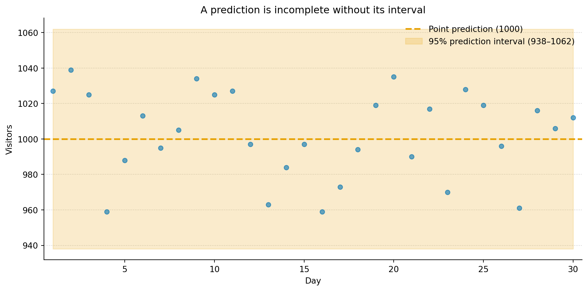
A prediction interval is the other half: it wraps the best guess in a range that owns up to how much the model doesn’t know. “Between 938 and 1,062 visitors, with 95% probability” is a different kind of statement from “1,000.” You get the centre — the best guess; the width — how much doubt is left; and the coverage — how often the truth is meant to land inside. The centre is the part everyone quotes. The other two are where the useful information hides.
Show the code behind this figure
import numpy as npimport matplotlib.pyplot as pltrng = np.random.default_rng(42)days = np.arange(1, 31)lam =1000visitors = rng.poisson(lam=lam, size=30)# For a Poisson with large λ, the normal approximation gives a prediction intervallower = lam -1.96* np.sqrt(lam)upper = lam +1.96* np.sqrt(lam)fig, ax = plt.subplots(figsize=(10, 5))fig.patch.set_alpha(0)ax.patch.set_alpha(0)ax.scatter(days, visitors, color='#0072B2', alpha=0.6, s=30, zorder=3)ax.axhline(lam, color='#E69F00', linewidth=2, linestyle='--', label=f'Point prediction ({lam})')ax.fill_between(days, lower, upper, color='#E69F00', alpha=0.20, label=f'95% prediction interval ({lower:.0f}–{upper:.0f})')ax.set_xlabel('Day')ax.set_ylabel('Visitors')ax.set_title('A prediction is incomplete without its interval')ax.set_xlim(0.5, 30.5)ax.spines['top'].set_visible(False)ax.spines['right'].set_visible(False)ax.yaxis.grid(True, linestyle=':', alpha=0.4, color='grey')ax.set_axisbelow(True)ax.legend(loc='upper right', framealpha=0.0)plt.tight_layout()plt.show()
Figure 1: A point prediction (amber dashed line) says where the centre is. The prediction interval (shaded band) says how much to trust it. Wider intervals mean more uncertainty, and more honest communication about the limits of the model.
The shaded band is the interval. Most days land inside it; a few don’t — which is exactly what a 95% interval is promising, not a sign it’s broken. It isn’t a guarantee. It’s a calibrated admission of doubt, which is a more honest thing for a model to hand you than a lone confident number.
Same guess, very different worlds
The width carries something the centre can’t: whether you actually know enough to act.
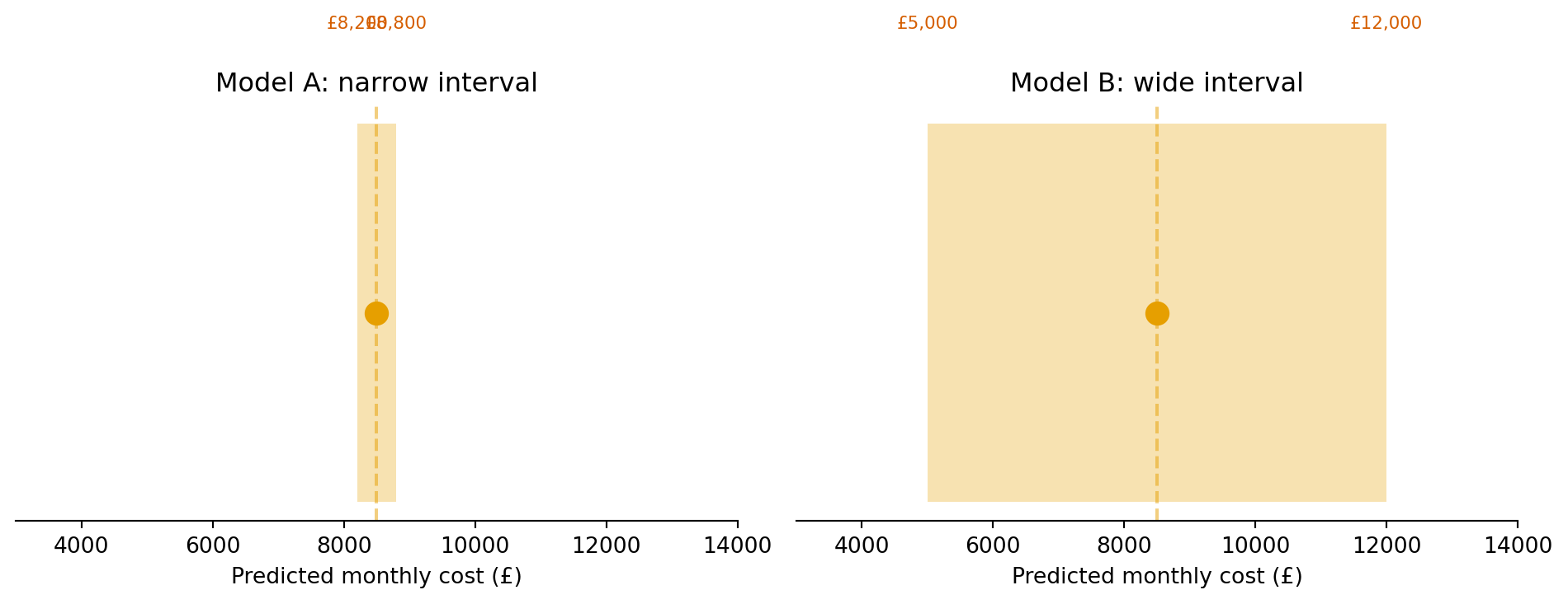
Picture two models forecasting next month’s server bill. Model A says £8,200–£8,800. Model B says £5,000–£12,000. They might share the identical point prediction — £8,500 — and still be telling you completely different things. A is saying I’m fairly sure. B is saying I genuinely don’t know. How much to reserve, whether to pre-buy capacity, whether to go and collect more data first — all of that rides on the width, and none of it on the centre they agree about.
Figure 2: Two models with the same point prediction but very different intervals. Model A (left) gives you enough precision to act. Model B (right) is telling you it doesn’t know enough yet; that honesty is more useful than a false sense of certainty.
A wide interval isn’t the model failing. It’s the model being honest about what it can’t see yet — and that honesty is the actionable part. It tells you to go and find a better feature, gather more data, or design the decision so it survives the whole range rather than betting the result on a single estimate.
It shrinks, then it stops
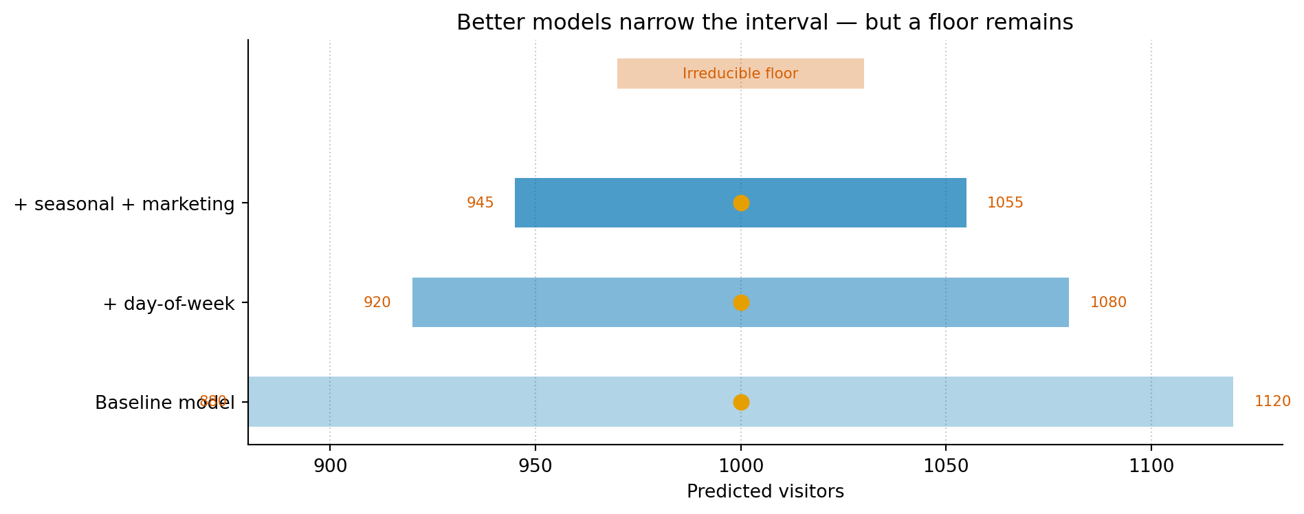
This is the other side of the line between reducible and irreducible error. Give the model something genuinely useful — a better feature, more data, a structure that actually fits — and the interval tightens: more of the variation is explained, so less is left to doubt.
But it never closes to a point. There’s a floor, set by the randomness that lives in the process itself, and no amount of modelling gets you under it. Knowing roughly where that floor sits is one of the quietly most useful things a model can tell you — it’s the line between effort that pays and effort that’s chasing a precision the world doesn’t contain.
Show the code behind this figure
models = [ ('Baseline model', 1000, 120), ('+ day-of-week', 1000, 80), ('+ seasonal + marketing', 1000, 55),]fig, ax = plt.subplots(figsize=(10, 4))fig.patch.set_alpha(0)ax.patch.set_alpha(0)irreducible =30# floorfor i, (label, centre, half_width) inenumerate(models): ax.barh(i, 2* half_width, left=centre - half_width, height=0.5, color='#0072B2', alpha=0.3+0.2* i) ax.plot(centre, i, 'o', color='#E69F00', markersize=8, zorder=3) ax.text(centre - half_width -5, i, f'{centre - half_width}', fontsize=8, ha='right', va='center', color='#D55E00') ax.text(centre + half_width +5, i, f'{centre + half_width}', fontsize=8, ha='left', va='center', color='#D55E00')# Irreducible floorax.barh(len(models) +0.3, 2* irreducible, left=1000- irreducible, height=0.3, color='#D55E00', alpha=0.3)ax.text(1000, len(models) +0.3, 'Irreducible floor', fontsize=8, ha='center', va='center', color='#D55E00')ax.set_yticks(range(len(models)))ax.set_yticklabels([m[0] for m in models])ax.set_xlabel('Predicted visitors')ax.set_title('Better models narrow the interval — but a floor remains')ax.spines['top'].set_visible(False)ax.spines['right'].set_visible(False)ax.xaxis.grid(True, linestyle=':', alpha=0.4, color='grey')ax.set_axisbelow(True)plt.tight_layout()plt.show()
Figure 3: As models improve, prediction intervals narrow — but they never reach zero. The remaining width is irreducible uncertainty. Knowing where this floor sits tells you when to stop modelling and start making decisions.
Each new feature tends to buy a little less than the last, until you reach the point where what’s left isn’t missing information but genuine noise. That’s the floor. Recognising it is what stops you grinding away at a fourth decimal place that was never on offer.
The width is the decision
All of which lands on the thing you were going to do anyway: decide something.
If tomorrow’s traffic interval is 950–1,050, you provision for 1,050 and get on with your day. If it’s 700–1,300, the same centre demands a different plan entirely — autoscaling, a buffer, a fallback. Same point prediction, opposite decisions, and the only thing that changed was the width. Which is why a forecast handed to whoever signs off the budget should never arrive as a lone number: strip the interval off and you’ve quietly made the decision for them — and hidden that you did.
If that logic feels familiar, it should — it’s the one you already run on the ops side. An SLO never claims the system always responds in 300ms; it says 99.9% of the time it will, and budgets, out loud, for the 0.1% that won’t. A prediction interval is the same bargain applied to a model’s output: here’s the range, here’s the probability, here’s how to plan for the times it falls outside. You’ve been thinking in intervals for years. You just spelled it error budget.
Once that clicks, a bare point prediction starts to look like a dashboard showing only the average. Technically true. Practically not enough to act on. The part you can actually use was always the spread around it.
This article is part of a series drawn from Thinking in Uncertainty, a book that teaches data science to experienced software engineers.