Bumping to the newest release feels like hygiene: newer is better, and a green build is a green light. But a day-old release is the least-tested it will ever be — time since publication is sample size, and on day zero your sample is almost nobody. GitHub’s new dependency cooldown isn’t caution for its own sake; it’s waiting for the standard error to come down.
Author
Matthew Gibbons
Published
18 July 2026
The pull request had opened itself overnight, the way they do. Dependabot had spotted a new version of some dependency three levels down from anything I think about, bumped the number, and waited politely for me to press the button. The build was green. I pressed the button. I have pressed that button hundreds of times, on autopilot, because the whole point of the machinery is that I don’t have to think about it: newer is better, the tests pass, merge and move on.
Then this week I read the line in the GitHub changelog that made me stop. Dependabot now waits until a new release has been sitting on its registry for at least three days before it will even open the pull request. The cooldown is the default now; you have to opt out. My first reaction was the pure engineer’s reaction — a flash of irritation. Why introduce a deliberate delay into something safe and automatic? If the fix is out, I want to be on it. But the delay isn’t caution for its own sake, and it isn’t distrust of the maintainer. It’s waiting for evidence, and the reason it feels strange is that it treats a version number as something an engineer almost never treats it as: a measurement that hasn’t finished being taken.
A fresh release is a sample of almost nobody
Here is what I think I’m actually asking when I adopt a version, once I slow the button-press down enough to look at it. Not “is this the latest?” — that’s on the tin. You’re asking “will this one hurt me?”: will it break a build, quietly regress some behaviour, or, in the modern nightmare, carry something malicious that shipped in the tarball. That’s a rate — the fraction of people who pull this release and hit a serious problem — and a rate is a thing you estimate from a sample. On the day of release, the sample is the maintainer, a CI pipeline, and whichever handful of enthusiasts live on the bleeding edge. Call it five. Your own green build adds one more draw to the pile.
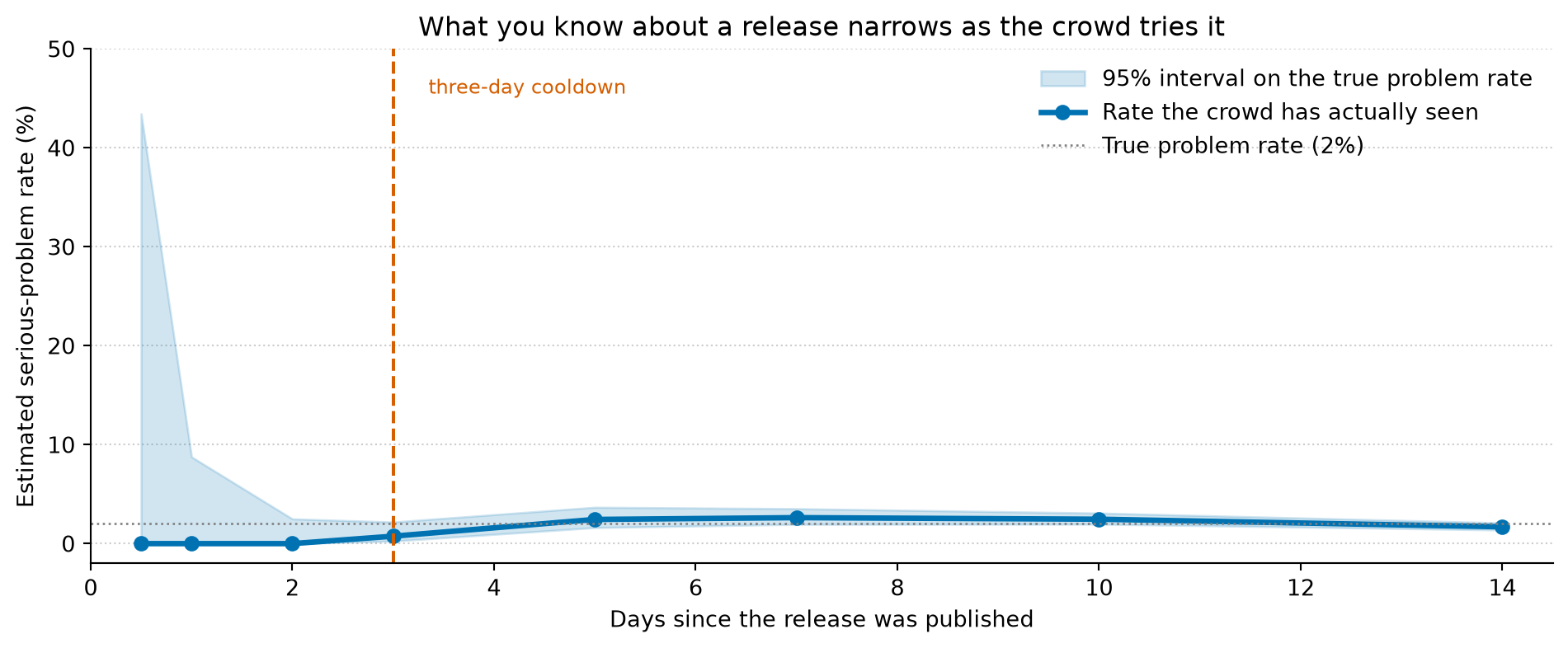
From a sample that size you cannot estimate a rate at all. The standard error of a proportion goes like sqrt(p(1-p)/n), and with n in single figures that quantity is enormous — the honest interval around “is this release safe” runs from obviously fine all the way to seriously broken, with nothing to separate them. The release isn’t good yet and it isn’t bad yet; it’s unmeasured. What the following days actually do is not improve the software. They grow the sample. Every install is another independent trial, and as the crowd runs the release thousands of times the interval around its true problem rate collapses from the whole range down to a point or two.
Show the code behind this figure
import numpy as npimport matplotlib.pyplot as pltrng = np.random.default_rng(0)p_true =0.02# 2% of adopters hit a serious problem with this release# How the adopter sample grows in the days after a release lands.days = np.array([0.5, 1, 2, 3, 5, 7, 10, 14])n = np.array([5, 40, 150, 400, 900, 1600, 3000, 5000])# Each day, the crowd has run the release n times; count the serious problems.k = rng.binomial(n, p_true)# Wilson 95% score interval for a proportion — well behaved even when k is 0.z =1.96centre = (k + z**2/2) / (n + z**2)half = (z / (n + z**2)) * np.sqrt(k * (n - k) / n + z**2/4)lower = np.clip(centre - half, 0, 1)upper = np.clip(centre + half, 0, 1)fig, ax = plt.subplots(figsize=(10, 4.2))fig.patch.set_alpha(0)ax.patch.set_alpha(0)ax.fill_between(days, lower *100, upper *100, color='#0072B2', alpha=0.18, label='95% interval on the true problem rate')ax.plot(days, (k / n) *100, '-o', color='#0072B2', linewidth=2.5, label='Rate the crowd has actually seen')ax.axhline(p_true *100, color='grey', linewidth=1, linestyle=':', label='True problem rate (2%)')# The three-day cooldown.ax.axvline(3, color='#D55E00', linewidth=1.5, linestyle='--')ax.annotate('three-day cooldown', xy=(3, 47), xytext=(3.35, 47), ha='left', va='top', color='#D55E00', fontsize=9)ax.set_xlabel('Days since the release was published')ax.set_ylabel('Estimated serious-problem rate (%)')ax.set_title('What you know about a release narrows as the crowd tries it')ax.set_ylim(-2, 50)ax.set_xlim(0, 14.5)ax.legend(frameon=False, loc='upper right')ax.spines['top'].set_visible(False)ax.spines['right'].set_visible(False)ax.yaxis.grid(True, linestyle=':', alpha=0.4, color='grey')ax.set_axisbelow(True)plt.tight_layout()plt.show()
Figure 1: A release with a true serious-problem rate of 2% (grey dotted line), watched over the fortnight after it ships. Each day the crowd has installed it some number of times, and we count the problems and form a 95% confidence interval on the underlying rate (blue band, Wilson score interval). In the first day the sample is only a handful of adopters: the crowd has ‘seen’ a rate of zero, but the interval it can support still spans from nothing to tens of per cent — fine and broken are indistinguishable. By the time the sample has grown into the thousands the interval has closed to a point or two either side of the truth. The three-day cooldown (orange) is roughly where the band first gets narrow enough to act on.
Time since release is sample size. That is the whole idea, and once it was in front of me the cooldown stopped looking like a brake and started looking like a fairly ordinary piece of statistical hygiene: don’t quote an estimate until enough of the sample is in to make it mean something.
“No problems reported” is a sample size, not a verdict
The seductive thing about a brand-new release is that nothing is wrong with it. No issues filed, no version yanked, no incident thread three hundred replies deep. It has a clean record. And that clean record is the most misleading number of the lot, because zero reported problems out of five adopters is exactly what a catastrophic release also looks like on its first morning. Absence of evidence arrives before evidence of absence, always, and by a margin measured in days.
The statistic that actually carries the information isn’t the count of problems — it’s the upper bound on the rate, given how many people have looked. There’s a back-of-an-envelope version of this precise question, and it’s worth carrying around: the rule of three. If you’ve observed zero events in n independent tries, the 95% upper bound on the underlying rate is about 3/n. Five adopters and no complaints puts the ceiling on the problem rate at around 60% — you have learned essentially nothing. Four hundred adopters and no complaints, which is roughly the sample those three days of waiting buy you, puts the ceiling under 1%. Same “zero problems reported”, two completely different states of knowledge. The cooldown isn’t waiting for something to go wrong. It’s waiting until enough eyes have looked that their silence is finally worth something.
This isn’t the leaderboard problem again
It’s a cousin of something I’ve written about before — that a leaderboard prints no error bars, and the gap between first and second is usually well inside the noise — but it’s a different failure and worth keeping apart. There, the sample was fixed: the benchmark had been run, the number was as good as it was going to get, and the fix was to supply the interval the table had cropped off and read the top three as the tie they were. Here the sample is not fixed; it grows with time, on its own, whether you look or not. So the fix isn’t to compute the missing interval once. It’s to wait for the interval to shrink. The leaderboard’s uncertainty was a standing fact about a measurement. This uncertainty has a half-life. You don’t need a better estimate of the new release’s safety so much as a later one.
What the wait actually buys
Waiting is not the same as never upgrading, and the people turning cooldowns on by default are not luddites hoarding old versions. What they’ve internalised is that adopting a fresh release is a decision made under uncertainty, and the uncertainty is fattest at precisely the moment the enthusiasm is, too. The prior on any given release is that it’s probably fine — most are — but “probably fine” hides a tail, and the tail is where the compromised package and the silent regression live. Three days let the world’s data update that prior before you commit to it. You are not gathering the evidence yourself; you are borrowing the crowd’s, which is the cheapest evidence there is.
And once it’s a decision under uncertainty rather than a hygiene chore, the rule stops needing to be blanket. Where a bad draw is cheap and reversible — a local dev tool, a pinned image you can roll back in a minute — adopt early and be the sample yourself; someone has to. Where a bad draw is expensive — a dependency that ships to production, that touches authentication, that thousands of your own users will run downstream — let someone else be the sample first. It’s the same calculus a seasoned experimenter uses when they refuse to call a test on the first day of data: not because early data is wrong, but because acting on it is a bet whose odds improve for free if you can bear to wait. Simon Willison’s habit of pinning his toolchain to “the newest version as of a fixed date” a little in the past is this same instinct wearing different clothes — not newest, but newest-that’s-had-time.
Newest is a timestamp. Trustworthy is a sample size. I spent a long career treating the first as a proxy for the second, and in fairness to my younger self, on most days it very nearly is.
I notice the argument has landed better in my head than in my hands. The flash of irritation is still there when the pull request doesn’t arrive, and there’s a version of this argument that curdles into never upgrading at all, which is its own way of getting hurt. What the cooldown actually does is narrower than the case I set out to make: it stops me confusing the timestamp for the evidence for three days, and lets the error bars catch up with the version number. That’s a smaller claim than the one I started writing. I think it’s the one that survives.
Part of an occasional series reframing everyday engineering through a data scientist’s eyes. The ideas here are developed properly in Thinking in Uncertainty and Building with Certainty.